
Before nearly a single note plays, the album cover has already told you something. It sets a mood, plants an image in your mind, and — if the art is great enough — becomes as inseparable from the music as the songs themselves. Classic rock understood this better than almost any other genre in history.
From the late 1960s through the 1980s, bands and their designers turned the 12-inch vinyl sleeve into a canvas for some of the most enduring visual art of the 20th century. These weren’t marketing afterthoughts. They were statements. And decades later, many of those images are still instantly recognizable to people who weren’t even alive when the records came out.
The topic of the best classic rock album covers is one that sparks real debate — because the competition is genuinely fierce. Here’s a look at what makes these covers so powerful, which ones consistently rank among the greatest, and why the visual identity of classic rock still matters today.
Why Classic Rock Album Covers Hit Different
There’s a reason people talk about these covers the way they talk about photographs or paintings. The vinyl era forced a certain kind of ambition. A 12-by-12-inch square was a significant piece of real estate, and the best artists and designers of the era treated it that way.
The covers that endure tend to share a few qualities. They’re visually bold — designed to catch the eye across a record store aisle. They carry meaning that rewards a second or third look. And they feel connected to the music itself, not just slapped on top of it.
That combination is rarer than it sounds. Many albums have great music and forgettable art. The covers that truly defined an era managed both at once.
The Classic Rock Album Covers That Shaped Visual History
Several covers come up repeatedly in any serious conversation about the best of the era. The names behind them — both the bands and the designers — are worth knowing.
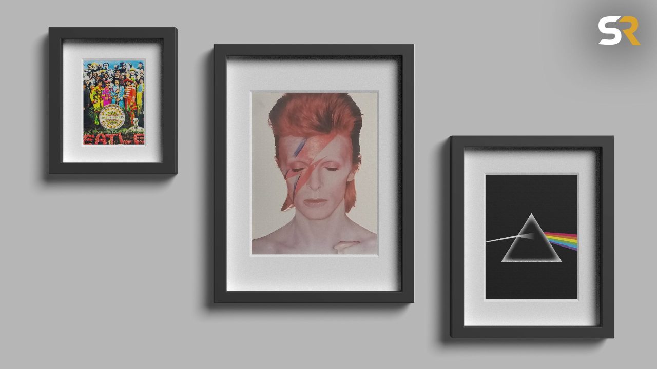
- Pink Floyd – The Dark Side of the Moon (1973): Storm Thorgerson and Hipgnosis created one of the most recognizable images in music history — a prism refracting white light into a spectrum. Simple, geometric, and perfectly matched to the album’s themes of perception and time.
- Led Zeppelin – Led Zeppelin IV (1971): No band name. No album title. Just an old photograph of a man carrying sticks on his back, hung on a crumbling wall. The deliberate anonymity became its own statement.
- The Beatles – Sgt. Pepper’s Lonely Hearts Club Band (1967): Designed by Peter Blake and Jann Haworth, this cover changed what an album sleeve could be — a dense, layered tableau of cultural figures that people spent years picking apart.
- The Rolling Stones – Sticky Fingers (1971): Andy Warhol’s design featured an actual working zipper on the front cover. It was provocative, tactile, and completely unlike anything else on the market.
- David Bowie – Aladdin Sane (1973): The lightning bolt across Bowie’s face, shot by Brian Duffy, became one of the defining images of glam rock — and of Bowie’s entire career.
- Fleetwood Mac – Rumours (1977): A deceptively simple portrait of Mick Fleetwood and Stevie Nicks that somehow captured the romantic chaos swirling inside the band at the time.
- The Eagles – Hotel California (1976): The Beverly Hills Hotel at dusk, shot with an eerie warmth that perfectly matched the album’s sun-bleached California dread.
- Queen – News of the World (1977): Frank Kelly Freas adapted his own science fiction painting to create a giant robot cradling the band’s lifeless bodies — visceral, strange, and unforgettable.
What Separates the Iconic From the Merely Good
| Album | Artist | Year | Key Visual Element |
|---|---|---|---|
| The Dark Side of the Moon | Pink Floyd | 1973 | Prism light spectrum on black background |
| Led Zeppelin IV | Led Zeppelin | 1971 | Anonymous hermit figure, no band name |
| Sgt. Pepper’s | The Beatles | 1967 | Crowded tableau of cultural figures |
| Sticky Fingers | The Rolling Stones | 1971 | Working zipper designed by Andy Warhol |
| Aladdin Sane | David Bowie | 1973 | Lightning bolt face paint by Brian Duffy |
| Rumours | Fleetwood Mac | 1977 | Intimate band portrait |
| Hotel California | The Eagles | 1976 | Dusk shot of the Beverly Hills Hotel |
| News of the World | Queen | 1977 | Frank Kelly Freas sci-fi robot illustration |
The covers that consistently rank highest share one trait: they don’t just illustrate the music — they extend it. The prism on The Dark Side of the Moon isn’t decoration. It’s a visual argument about the album’s themes. The zipper on Sticky Fingers isn’t a gimmick — it’s confrontational in exactly the way the Stones wanted to be.
That intentionality is what separates the truly great covers from ones that simply look nice.
Why These Images Still Matter in the Streaming Age
In an era where most people listen through a phone screen, album art has shrunk to a thumbnail. And yet the best classic rock covers haven’t lost their power. If anything, they’ve gained a kind of mythological status — reproduced on posters, t-shirts, tattoos, and phone cases by generations who discovered the music long after vinyl was the primary format.
That staying power says something. These images weren’t designed to be timeless — they were designed to sell records in a specific moment. The fact that they transcended that moment is a testament to the craft behind them.
Designers like Hipgnosis, Peter Blake, and Andy Warhol brought genuine artistic ambition to what could have been purely commercial work. The bands trusted them. The results changed visual culture in ways that still echo today.
Frequently Asked Questions
What is widely considered the greatest classic rock album cover of all time?
Pink Floyd’s The Dark Side of the Moon (1973), designed by Hipgnosis, is among the most consistently cited as the greatest — its prism image is one of the most recognized visuals in music history.
Who designed the cover for Sticky Fingers by the Rolling Stones?
The cover was designed by Andy Warhol and famously featured a real working zipper on the front.
Which classic rock cover is known for having no band name or album title?
Led Zeppelin’s Led Zeppelin IV (1971) was released with no band name, album title, or text on the front cover — a deliberate and bold creative choice.
Who photographed the iconic David Bowie Aladdin Sane cover?
The lightning bolt image was shot by photographer Brian Duffy in 1973 and became one of the defining portraits of Bowie’s career.
Did classic rock album cover art influence culture beyond music?
Yes — many of these covers, including Sgt. Pepper’s and The Dark Side of the Moon, are studied as significant works of graphic design and visual art, not just music packaging.
Which artist created the cover for Queen’s News of the World?
Science fiction illustrator Frank Kelly Freas adapted one of his own existing paintings to create the striking robot image on that cover.




Leave a Reply